Azealead

Role

Webflow Web Designer

Tools

Figma, Notion, & Webflow

Date

June 2024 - July 2024 (2 weeks)

Overview

Background & Goal

Key Question:

How can we design a user-friendly website that aligns with the semiconductor industry’s technical and modern aesthetic?

The goal of this freelance project was to design a five-page website (Home, Why Us, How It Works, Resources, and Contact page) for a start-up in the semiconductor industry using Webflow. The challenge was to design a user-friendly and visually compelling website that aligns with industry standards and communicates the company's vision clearly.

Brainstorming

Market Research

In order to gain more of an understanding of the semiconductor industry, I conducted market research. I started my research and brainstorming by browsing the websites of the current top companies in the semiconductor industry. Out of all the websites, I liked Marvell, AMD, Nvidia, and Qualcomm the most. For each website, I took notes on their color palettes, typography, and overall UI.

1. Marvell

2. AMD

3. Nvidia

4. Qualcomm

Moodboard

I created a mood board with all images to further solidify my understanding of the typical color palette in the semiconductor Industry. I found these images through Google Images and Adobe Stock.

Color Palette

A recurring theme among semiconductor industry websites is the use of a black background, often combined with a contrasting gradient to highlight key visuals. The predominant colors include black, white, blue, and purple. When paired with a black background, bold accent colors (e.g., green in Nvidia and orange in AMD) create a dynamic, high-tech feel.

As discussed with my client, the target audience for this website is primarily male. To appeal to this demographic, I selected gradients and color schemes that typically resonate with a male audience. The website will predominantly feature a dark theme to cater to this preference. Additionally, I created an alternative version with brighter colors for the client’s consideration.

Typography

The referenced websites use sans serif fonts, which are typefaces that do not have extending features at the end of strokes. The most commonly used sans serif fonts in these websites are Arial, Roboto, and Open Sans. I chose Roboto as the font since it offers more font weights to create both subtle and greater distinction between my headers and paragraphs.

Outlining and Planning

low fidelity Wireframes

With my research complete, I began thinking about how to translate these findings into the website’s design. Having already identified a suitable color palette and typography, my next step was to develop the layout for each page, ensuring the user experience was intuitive and aligned with the client’s goals.

The client provided a document with the headings and written content for each page. Using this, I broke down the content into clear sections and began wireframing the layout. My aim was to create a structure that not only flowed well but also guided users through the information effortlessly.

I created low-fidelity wireframes to focus on the overall layout and user flow without getting distracted by visual design details. I thought about what ways can we capture the user’s attention and how to retain their focus on the site. Using the section outline and the word document, it was easier to group related text and elements together. Text length helped me understand content strategy: how do I lay out the visual hierarchy to guide the user's attention.

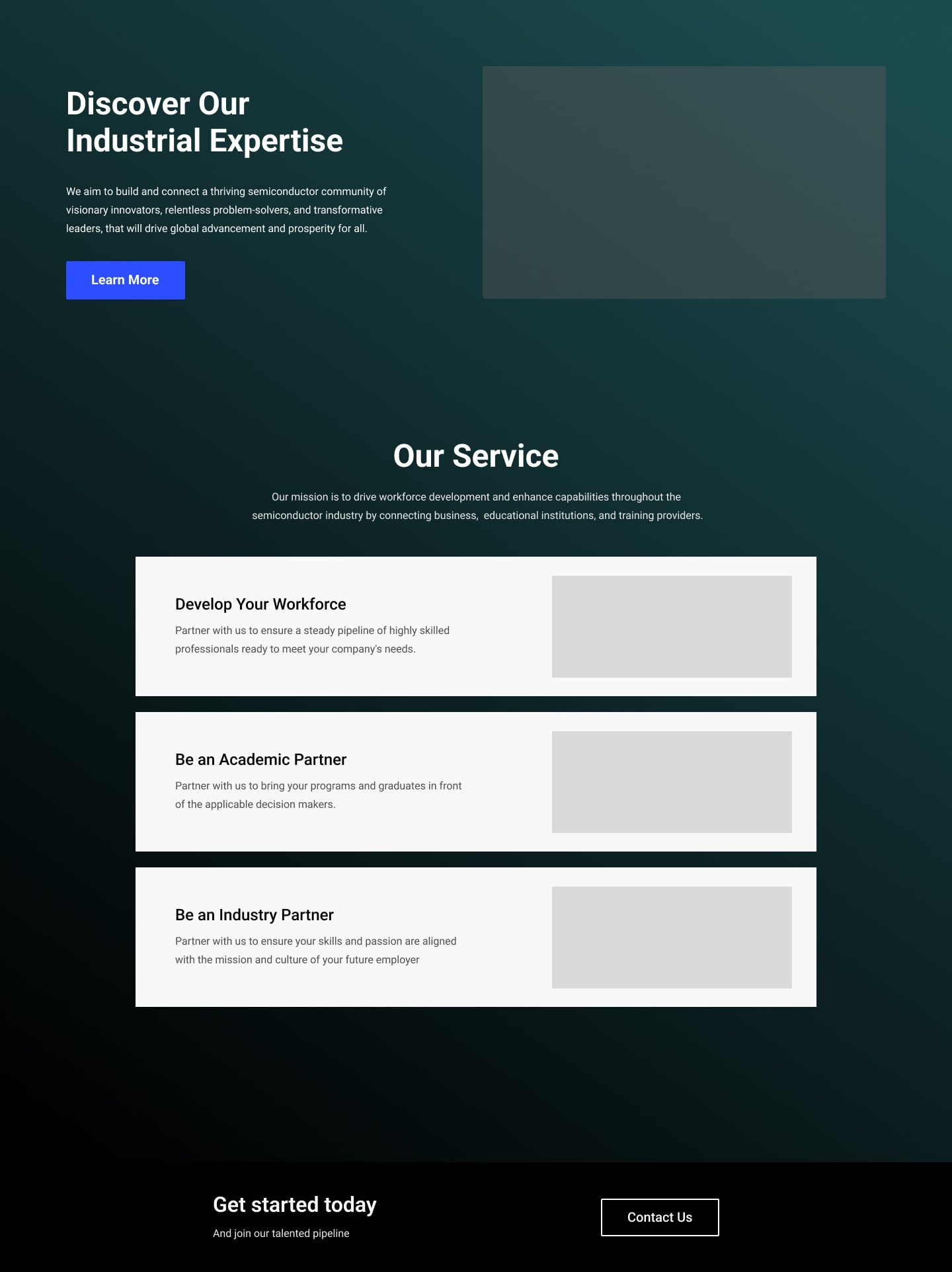
For instance, in Section Two of the Home page, the original content included four blocks summarizing the company's main purpose. However, after reviewing the text, I decided to combine two points into one and reduce the blocks to three. Grouping information into threes makes it easier for users to remember, and this also simplified the design. I chose a vertical layout, allowing users to focus on one point at a time before moving on to the next, enhancing readability and engagement.

In contrast, for the "Resources" page, I opted for a grid layout to allow users to scan multiple articles or blog posts quickly, ensuring that the structure remained organized without overwhelming the user with too much information at once.

Design Stage

Designing in Figma

Building upon the low-fidelity wireframes, I transitioned to high-fidelity designs in Figma, incorporating the initial color palette and refining the visual elements. I started by designing a simple light mode layout to keep the interface clean and accessible. However, I soon began experimenting with gradients to add more visual depth and alignment with the tech-forward aesthetic typical in the semiconductor industry.

Home Hero Sect. v1 - Light
Hero Home Sect. v1 - Dark
Home Hero Sect. v2 - Dark
Home Sect. 1 & 2 v1 - Light
Home Sect. 1 & 2 v1 - Dark
Home Sect. 1 & 2 v2 - Dark

After presenting the design options to my client, we had a discussion about our preferences. While the client initially leaned toward the lighter version, we ultimately agreed that a mix of dark and light sections would create better visual contrast and improve user engagement. This contrast also helped differentiate content sections, making navigation smoother and more intuitive. This approach allowed us to strike the right balance between visual appeal and functional clarity, ensuring that the design not only looked polished but also aligned with the brand’s goals and user needs.

Above is the finalized color palette:
  • The primary background is (#F5F5F5), but the dark blue (#202236) was retained for dark mode sections to convey professionalism and stability.
  •  The lighter end of the gradient was adjusted from its original shade to a more muted blue (#2B3456), creating a subtle contrast that doesn’t overpower the content.
  • For CTAs and interactive elements, we chose a vibrant red (#E72E48) to draw attention to key actions on the site, such as buttons.
  • A bright green (#40DEAE) was also used for secondary buttons and headers in darker sections, adding balance while maintaining readability and consistency.

Development and Launch

Building On Webflow

Due to time constraints, we continued using a Webflow template as a base but customized many of its components to better fit the project needs. One of the primary changes was creating new Webflow classes to maintain a consistent design language across the site and ensure mobile responsiveness. Additionally, I made enhancements to web accessibility and implemented subtle animations to guide users toward key elements, improving overall user engagement.

Throughout the development process, I collaborated closely with the client, gathering feedback and making adjustments, especially on the Resources page layout. We aimed to strike the right balance between content accessibility and a clean, minimalist design. After usability testing and final tweaks, the site was ready for launch.

For example, during usability testing, we discovered that in Section 2 of the homepage, the pointer cursor appeared when hovering over certain blocks, which was part of the original template. Users mistakenly believed these blocks were clickable, leading to confusion. To resolve this, I changed the pointer to a default cursor, which eliminated the confusion and clarified that the blocks were not interactive.

Original: Pointer Mouse
After Usability Testing: Default Mouse

Reflection

Next Steps

The initial phase focused on establishing a professional framework to effectively present the start-up's vision to potential stakeholders. However, due to time and budget constraints, several elements were simplified or omitted. The following areas have been identified for future iterations, each with a clear impact on user experience and business objectives:

Brand Identity

Developing and integrating a logo will enhance brand recognition and foster trust among users. A strong brand identity helps differentiate the start-up in a competitive market, making it easier for users to recall and engage with the brand.

Contact Information and Social Proof

Updating the "Contact Us" and "Footer" sections with dedicated contact channels (phone number, email, social media) will build credibility and facilitate user inquiries. Providing accessible contact information can improve user satisfaction and conversion rates by making it easier for potential clients to reach out for more information.

Resource Page Navigation:

By implementing clickable resource thumbnails and replacing the small "Learn More" text with prominent buttons, users will find it easier to access content. This change enhances usability and encourages exploration of resources, ultimately leading to increased time spent on the site and a deeper engagement with the brand's offerings.

Content Consistency

Updating the "Contact Us" and "Footer" sections with dedicated contact channels (phone number, email, social media) will build credibility and facilitate user inquiries. Providing accessible contact information can improve user satisfaction and conversion rates by making it easier for potential clients to reach out for more information.